Top Responsive Web Design Principles You Need To Know

by | Sep 12, 2024

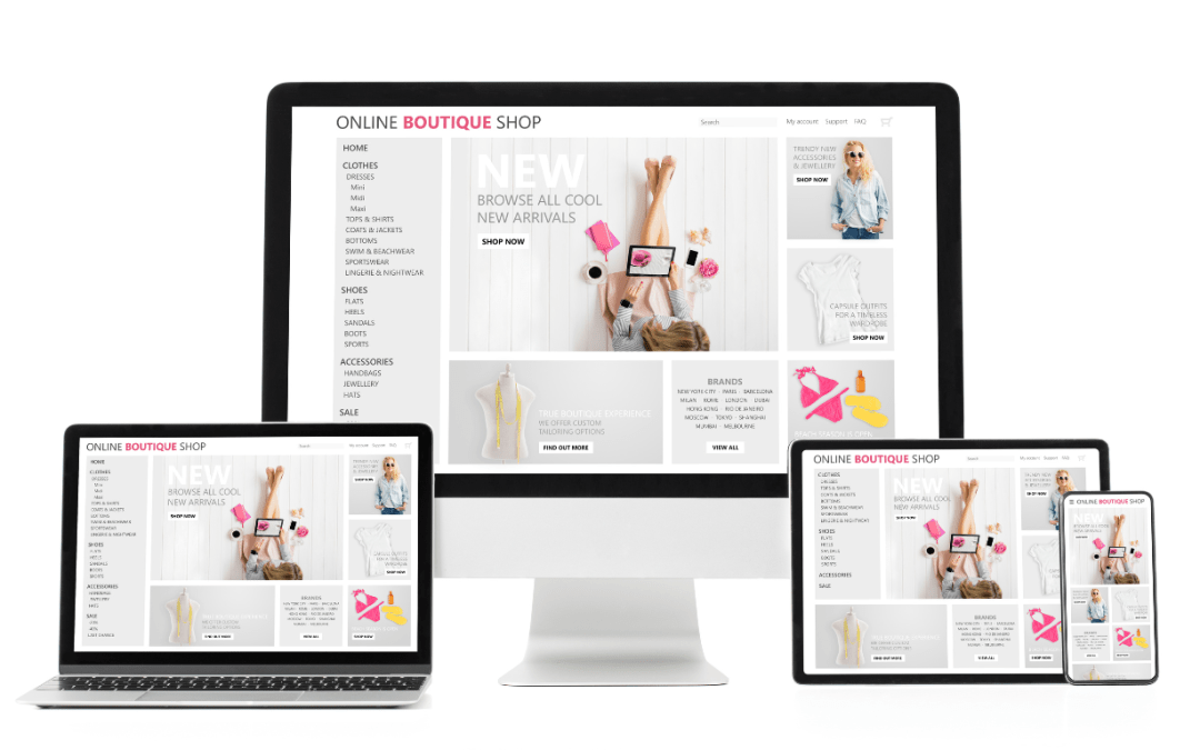
Responsive web design is an approach to making web pages render well on various devices and window or screen sizes. It uses flexible layouts and images, as well as media queries that detect the user’s screen size and adjust the design accordingly. Responsive web design ensures a well-structured, user-friendly, and responsive web page that looks great and functions well on various devices and web browsers.

Responsive web design aims to ensure seamless user access and navigation across various devices, including desktop computers, laptops, tablets, and smartphones. By eliminating the need for separate website versions, responsive design creates a single adaptable website that caters to users’ access to different viewing environments.

Partnering with a reputable web design company can help you realize the primary goal of responsive web design – providing easy access and navigation for users across all devices.

Key Takeaways

  • Responsive web design is more than just aesthetics. It’s a crucial factor in ensuring optimal user experience, accessibility, and engagement across various devices.
  • Designing websites that seamlessly adapt to different screen sizes and orientations can improve conversion rates, enhance brand perception, and reach a wider audience.
  • Modern responsive web design leverages powerful techniques like Flexbox, CSS Grid, and CSS variables to create dynamic and efficient layouts.

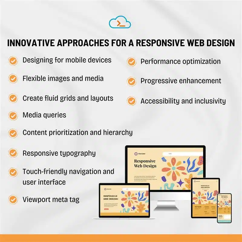
Innovative Approaches For a Responsive Web Design

Responsive web design (RWD) ensures that websites provide an optimal user experience across various devices and screen sizes. Below are the top principles of responsive web design :

1. Designing for mobile devices

Mobile-first design is a crucial principle in crafting websites that resonate with online visitors’ current needs and expectations. Designing for mobile devices involves prioritizing simplicity, efficiency, and a streamlined user experience. The mobile-first design prioritizes small screens to ensure a seamless user experience across various devices. Start by designing for the smallest of smaller screens at first, then gradually add complexity for larger screens. This approach ensures that the core experience remains intact, regardless of the device.

2. Flexible images and media

Images, videos, and other media should adjust in size relative to screen space for their containing elements using max-width properties (e.g., `max-width: 100%`). This prevents media from overflowing their containers on smaller screens. These images also resize proportionally to maintain their aspect ratio as the screen width changes.

3. Create fluid grids and layouts

Designing responsive websites that adapt to different devices and screen sizes relies on the use of flexible layouts and grids. Using relative units and percentages to define the size and positioning of elements within a website’s layout fluid grids ensures flexibility.

4. Media queries

CSS(cascading style sheets) media queries allow you to implement different styles for different screen sizes. By specifying breakpoints (e.g., 768px for tablets and 1024px for desktops), you can create tailored designs and optimize images that ensure usability and readability on all devices.

5. Content prioritization and hierarchy

Content prioritization and hierarchy are crucial for designing responsive websites that cater to diverse devices and user preferences. Prioritizing content according to its importance and relevance ensures a user’s device-friendly experience. Effective visual hierarchy is the art of arranging content in a manner that effortlessly guides visitors through the information. Content marketing services suggest and guide businesses in appropriate content prioritization.

6. Responsive typography

Use scalable fonts (like `em` or `rem` units) to ensure that text is legible on both small and large screens. Responsive typography adjusts font sizes dynamically based on screen size and device.

7. Touch-friendly navigation and user interface

Intuitive navigation is essential for responsive web design, prioritizing clarity and accessibility. Navigation menus should be clear and intuitive, allowing users to access various sections easily. User-friendly forms and interactive elements are also essential for a responsive website. Design buttons and interactive elements to be large enough and spaced appropriately for touch interaction. A good rule of thumb is to use a minimum touch target size of 44×44 pixels for mobile devices.

8. Viewport meta tag

Make sure always to include the viewport meta tag in the HTML head. Tagging will allow you to control the layout on mobile browsers and ensure that the design scales properly. The tag you should use is: “

9. Performance optimization

Load time and performance optimization are crucial for a positive user experience. Optimizing images, using caching strategies, and minimizing code can improve website performance. For consistent performance, one should prioritize performance by optimizing images, browser caching, reducing unnecessary assets, and using techniques like lazy loading to ensure quick load times on slower mobile networks.

10. Progressive enhancement

Ensure that your website or web page’s core content and functionality work even on older browsers or slower devices by layering additional features for newer, more capable browsers.

11. Accessibility and inclusivity

Executing responsive web design is essential for enhancing user feedback and accessibility across different devices. By prioritizing accessibility features such as keyboard navigation support and color contrast, we can ensure equal access and usability for users, including those with disabilities or impairments.
Innovative Approaches For a Responsive Web Design

Benefits Of Responsive Web Design

Responsive web design is crucial in today’s digital landscape, catering to diverse devices and user preferences. It ensures a seamless user experience across mobile devices, tablets, and desktop computers.

Responsive web design is essential for creating websites for mobile traffic that captivate and delight users, drive traffic, and achieve business goals.

Implementing Responsive Web Designs

Creating a responsive web design involves using media queries to insert different styles to a website based on the device or screen being used. Flexible images, grids, and media queries are essential for developing responsive websites under the expert advice of the best digital marketing agency in India.

Rigorous testing for responsiveness guarantees that the website adapts seamlessly and functions effectively across an array of devices and screen sizes.

Best Practices For Responsive Web Design

Adhering to best practices under guidance from top digital marketing services in Hyderabad, such as implementing a mobile-first approach and emphasizing quick load times, is crucial for optimal user experience when developing responsive websites. Keeping abreast of design trends and user expectations is vital for achieving success.

Giving priority to user feedback and employing an iterative design process is essential for improving the website.

Conclusion

In today’s digital world, it’s essential for website success to incorporate responsive web design. Embracing these principles enables the conception of websites that produce outstanding user experiences across all devices. This approach ensures a well-organized, user-friendly, and adaptable website that excels across various devices, mobile phones, and web browsers.

Frequently Asked Questions

What are the 3 basics for responsive web design?

  1. CSS Media Queries: Adapt layouts for different screen sizes.
  2. Fluid Layouts: Ensure content adjusts to various resolutions.
  3. Bootstrap: Utilize a responsive grid system and pre-built components.

What is a key thing you need to know about responsive design?

Reliable web development has a lot more than just aesthetics: it also involves usability, visual quality, accessibility, and participation.

What are the key elements of a good web design?

A good website is accompanied by several important components and design elements that are crucial for creating a user-friendly experience.

Aparna Sushumna

Aparna Sushumna

About The Author…

Aparna Sushumna, a mother to a hyperactive toddler who is all over the house. I aspire to be a decent content developer. A Bachelorette of technology says my qualification but I anticipated being a singer. Thanks to the recession, I dwelled into various jobs, from coding to being a tech support executive to a help desk professional, only to conclude that there is something else I wish to do. Here I am to accomplish my profound passion for content writing. Music, nature, jewelry, beauty, mythology, life quotes, celebs, and their life, being my areas of interest.

We use cookies to ensure that we give you the best experience on our website. If you continue to use this site we will assume that you are happy with it.

Cookies settings
Accept
Privacy & Cookie policy
Privacy & Cookies policy
Cookie name Active

Privacy Policy

What information do we collect?

We collect information from you when you register on our site or place an order. When ordering or registering on our site, as appropriate, you may be asked to enter your: name, e-mail address or mailing address.

What do we use your information for?

Any of the information we collect from you may be used in one of the following ways: To personalize your experience (your information helps us to better respond to your individual needs) To improve our website (we continually strive to improve our website offerings based on the information and feedback we receive from you) To improve customer service (your information helps us to more effectively respond to your customer service requests and support needs) To process transactions Your information, whether public or private, will not be sold, exchanged, transferred, or given to any other company for any reason whatsoever, without your consent, other than for the express purpose of delivering the purchased product or service requested. To administer a contest, promotion, survey or other site feature To send periodic emails The email address you provide for order processing, will only be used to send you information and updates pertaining to your order.

How do we protect your information?

We implement a variety of security measures to maintain the safety of your personal information when you place an order or enter, submit, or access your personal information. We offer the use of a secure server. All supplied sensitive/credit information is transmitted via Secure Socket Layer (SSL) technology and then encrypted into our Payment gateway providers database only to be accessible by those authorized with special access rights to such systems, and are required to?keep the information confidential. After a transaction, your private information (credit cards, social security numbers, financials, etc.) will not be kept on file for more than 60 days.

Do we use cookies?

Yes (Cookies are small files that a site or its service provider transfers to your computers hard drive through your Web browser (if you allow) that enables the sites or service providers systems to recognize your browser and capture and remember certain information We use cookies to help us remember and process the items in your shopping cart, understand and save your preferences for future visits, keep track of advertisements and compile aggregate data about site traffic and site interaction so that we can offer better site experiences and tools in the future. We may contract with third-party service providers to assist us in better understanding our site visitors. These service providers are not permitted to use the information collected on our behalf except to help us conduct and improve our business. If you prefer, you can choose to have your computer warn you each time a cookie is being sent, or you can choose to turn off all cookies via your browser settings. Like most websites, if you turn your cookies off, some of our services may not function properly. However, you can still place orders by contacting customer service. Google Analytics We use Google Analytics on our sites for anonymous reporting of site usage and for advertising on the site. If you would like to opt-out of Google Analytics monitoring your behaviour on our sites please use this link (https://tools.google.com/dlpage/gaoptout/)

Do we disclose any information to outside parties?

We do not sell, trade, or otherwise transfer to outside parties your personally identifiable information. This does not include trusted third parties who assist us in operating our website, conducting our business, or servicing you, so long as those parties agree to keep this information confidential. We may also release your information when we believe release is appropriate to comply with the law, enforce our site policies, or protect ours or others rights, property, or safety. However, non-personally identifiable visitor information may be provided to other parties for marketing, advertising, or other uses.

Registration

The minimum information we need to register you is your name, email address and a password. We will ask you more questions for different services, including sales promotions. Unless we say otherwise, you have to answer all the registration questions. We may also ask some other, voluntary questions during registration for certain services (for example, professional networks) so we can gain a clearer understanding of who you are. This also allows us to personalise services for you. To assist us in our marketing, in addition to the data that you provide to us if you register, we may also obtain data from trusted third parties to help us understand what you might be interested in. This ‘profiling’ information is produced from a variety of sources, including publicly available data (such as the electoral roll) or from sources such as surveys and polls where you have given your permission for your data to be shared. You can choose not to have such data shared with the Guardian from these sources by logging into your account and changing the settings in the privacy section. After you have registered, and with your permission, we may send you emails we think may interest you. Newsletters may be personalised based on what you have been reading on theguardian.com. At any time you can decide not to receive these emails and will be able to ‘unsubscribe’. Logging in using social networking credentials If you log-in to our sites using a Facebook log-in, you are granting permission to Facebook to share your user details with us. This will include your name, email address, date of birth and location which will then be used to form a Guardian identity. You can also use your picture from Facebook as part of your profile. This will also allow us and Facebook to share your, networks, user ID and any other information you choose to share according to your Facebook account settings. If you remove the Guardian app from your Facebook settings, we will no longer have access to this information. If you log-in to our sites using a Google log-in, you grant permission to Google to share your user details with us. This will include your name, email address, date of birth, sex and location which we will then use to form a Guardian identity. You may use your picture from Google as part of your profile. This also allows us to share your networks, user ID and any other information you choose to share according to your Google account settings. If you remove the Guardian from your Google settings, we will no longer have access to this information. If you log-in to our sites using a twitter log-in, we receive your avatar (the small picture that appears next to your tweets) and twitter username.

Children’s Online Privacy Protection Act Compliance

We are in compliance with the requirements of COPPA (Childrens Online Privacy Protection Act), we do not collect any information from anyone under 13 years of age. Our website, products and services are all directed to people who are at least 13 years old or older.

Updating your personal information

We offer a ‘My details’ page (also known as Dashboard), where you can update your personal information at any time, and change your marketing preferences. You can get to this page from most pages on the site – simply click on the ‘My details’ link at the top of the screen when you are signed in.

Online Privacy Policy Only

This online privacy policy applies only to information collected through our website and not to information collected offline.

Your Consent

By using our site, you consent to our privacy policy.

Changes to our Privacy Policy

If we decide to change our privacy policy, we will post those changes on this page.
Save settings
Cookies settings